Built a foundational design system to accelerate Hyp's product development.
When I joined the early-stage startup, I inherited a scattered, lightly documented Figma file that caused inconsistencies in the front-end.
Recognizing the gap between design and engineering, I proposed and led the creation of a structured, scalable design system; defining a standardized foundation to support agile development.
By the time I left, the design system enabled:
Nearly 4 hours reduction in weekly development time
80+ responsive components adopted across 60% of the product UI
A lightweight governance model for ongoing evolution
ROLE
Design system lead
TEAM
16 Engineers
3 Designers
TOOLS
Figma
Flutterflow
TIME
3 months project
Challenges to overcome
As Hyp expanded with new features and flows, the lack of a single source of truth led to fragmented custom builds across design and engineering, resulting in increasing design debt and system inconsistencies.
Visual inconsistencies
Screens became inconsistent due to varied color and typography.
Accessibility issues
Accessibility gaps led to poor usability and a frustrating user experience.
Lack of documentation
No usage guidelines led to delays in design and development.
Component fragmentation
Lack of a reusable component library led to inconsistent components.
SCOPE AND APPROACH
Target users: in-org teams and end users
The intention was to build a system that would streamline workflows for internal designers and developers, while also boosting usability for end users as a secondary focus.
I leveraged the following models to enable a scalable foundation
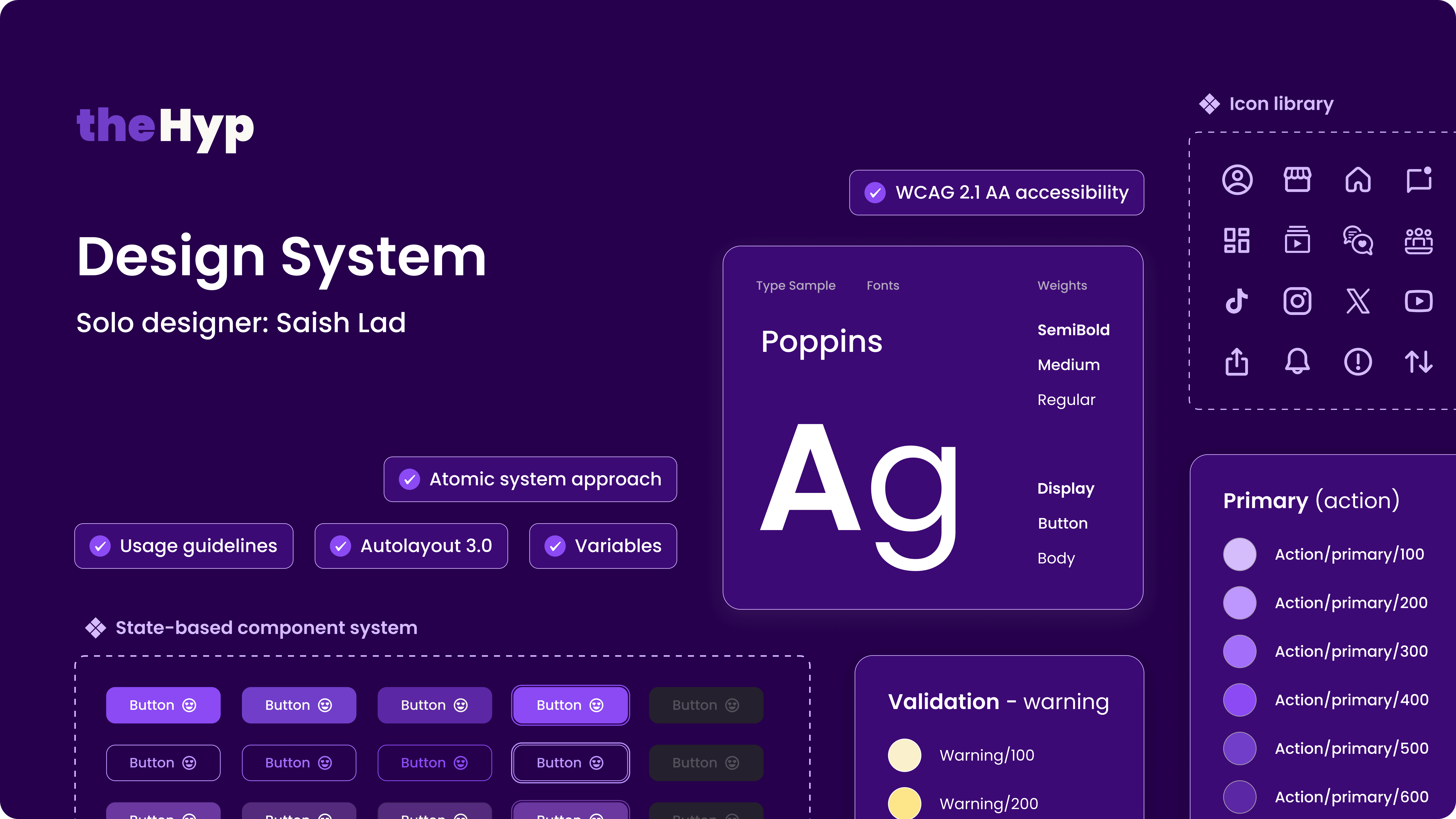
Token taxonomy
A structured token system to ensure consistency, scalability, and easier handoff across teams.
Atomic design principles
Refine and migrate existing elements to build reusable, modular components that accelerate development.
PHASE 1
Evaluating where the current system was breaking and rebuilding it from the ground up
This meant analyzing design and dev workflows, auditing the product, carrying forward key styles, resolving inconsistencies, and establishing clear rules with usage guidelines.
Phase 1 impact - featured from Figma files

UX Designer
Product Manager
A few more in figma :)
PHASE 2
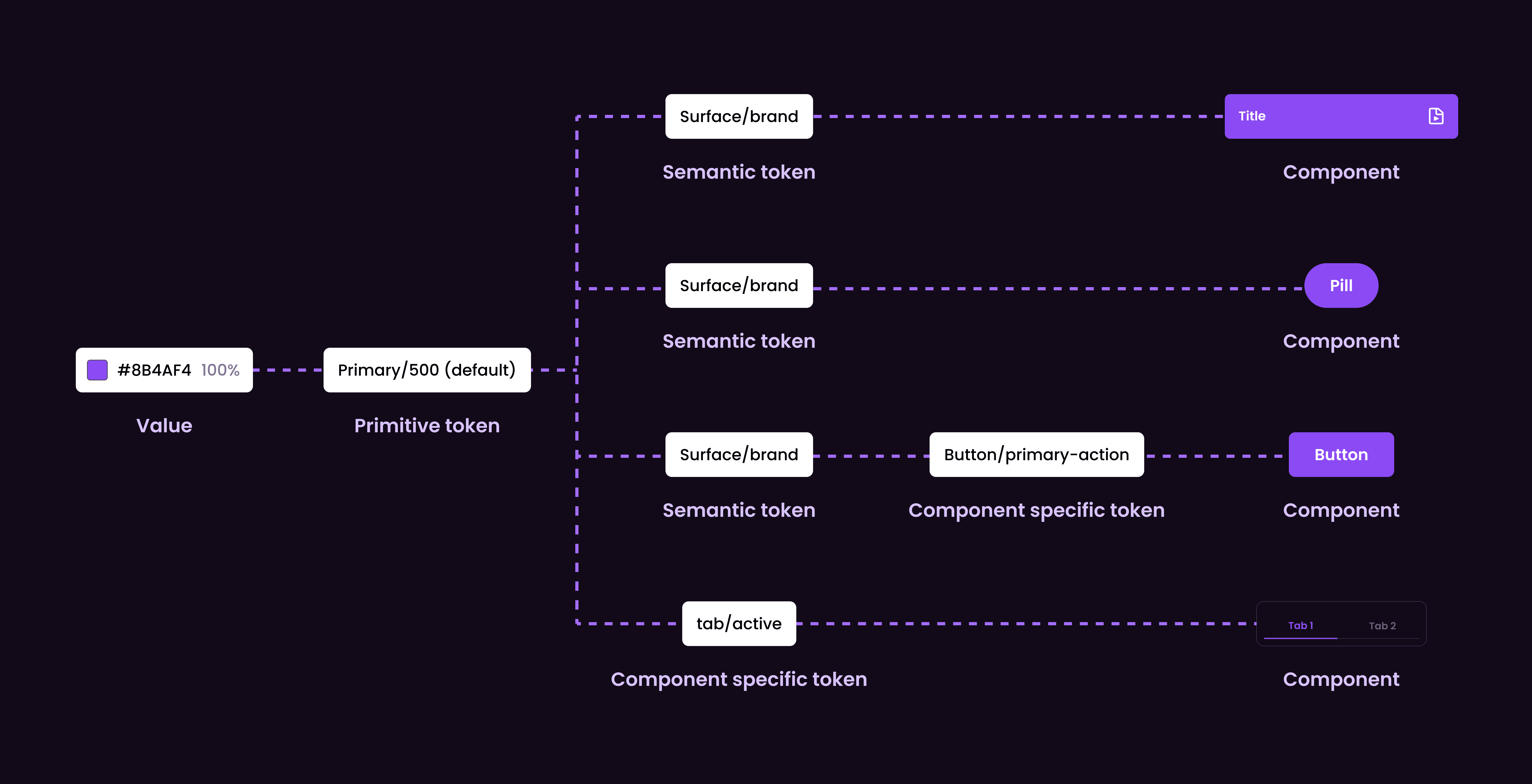
Building a robust token architecture to support agile development
This involved translating primitive tokens (for eg, raw color values) into semantic and component tokens, enabling consistent and maintainable UI design.
Phase 2 impact - observed within in org
3x
Faster design iterations
Standardized tokens reduced decision-making drag and manual UI changes across new screens and features.
20%
Reduction in design-dev clarification loops
Shared token definitions reduced ambiguity in component-specific usage, cutting design–dev alignment time.
PHASE 3
Designing a reusable component library to support consistent UI
Which meant redefining the current product UI using atomic design principles and the new token architecture, introducing missing components and standardizing patterns to ensure consistency.

Phase 3 impact - tracked during sprints
40% +
Component reuse rate
Enabled consistent UI assembly and eliminated one-off designs across new features.
2x
Faster feature turn-around time
Design-dev handoff time was significantly reduced for sprints.
SIGNING OFF
Closing my time at HYP by shipping a new UI, introducing a
lightweight governance model, and enabling DS adoption
As adoption and trust in the design system grew, the focus shifted to enabling teams to build and maintain it independently. I led workshops and 1:1 sessions to educate designers and developers, and introduced a sprint-integrated workflow to streamline contributions and support future scaling.
UI overhaul impact
+16%
User satisfaction score
Improved usability and clarity across key flows, leading to higher user satisfaction.
~ 60%
Product UI built with new system
Faster UI assembly and reduced rework for building designs from scratch.
~ 20%
Reduction in design QA issues
Clear and reusable patterns minimized inconsistencies and reduced UI-related bugs.
WCAG
Accessibility Compliance
Improved contrast and readability to reduce gaps and meet WCAG AA standards.
My key learnings
A design system is a product, not a deliverable
Treating the design system as a product shifted how I approached iteration, feedback, and scaling.
It required continuous improvement, stakeholder alignment, and measuring success through usage and impact, not completion.
Systems thinking requires identifying root causes, not just symptoms
Many UI inconsistencies were not just design issues; they were symptoms of missing patterns, unclear states, and gaps in developer workflows.
Addressing these foundational problems had a more lasting impact than fixing individual screens.
Designing systems is about people!
Early on, I assumed consistency would come from building components.
In practice, adoption improved when the system made the “right way” the easiest way for teammates with seamless integration into sprint workflows.
Education is a force multiplier
Investing time in educating the team had compounding returns.
As designers and developers became more confident using the system, they contributed back to it, turning adoption into shared ownership.
Thank you!